Overview
Analyzed vendor and brand performance for a retail and wholesale business from purchase, sales, price and freight records. Raw CSVs are loaded into SQLite, aggregated into a vendor-brand summary table, analyzed in Jupyter and presented in a Power BI dashboard.
The raw data isn’t distributed with the repository, so the project ships a data contract that describes the expected files and columns.
Problem
Which vendors and brands drive sales, purchasing spend and gross profit? How concentrated is purchasing among the largest suppliers? Which products combine low sales with high margins, where is capital tied up in slow-moving inventory, and how does order size relate to unit cost?
Approach
Built the summary at vendor-brand grain with SQL CTEs. Price records are matched on both vendor and brand, so a brand sold by several vendors isn’t counted twice.
Allocated each vendor’s freight across its brands in proportion to purchase dollars, so the allocated amounts still add up to the vendor total. A pytest regression test checks both rules: no duplicated purchases and freight that reconciles.
Kept every metric explicit: gross profit, net profit after allocated freight, profit margin, stock turnover and sales-to-purchase ratio.
Methodology
Ingestion
Python scripts load the raw CSVs into a local SQLite database and log each table.
Vendor-brand summary
A CTE query combines purchases, prices, sales and invoices into one row per vendor and brand.
Cleaning and filtering
Types and text are standardized. For the analysis, rows with non-positive profit or margin and zero sales are excluded: 8,564 of 10,692 rows remain.
Exploratory and statistical analysis
Distributions, outliers, correlations, vendor concentration, turnover, 95% confidence intervals and a t-test on margins, in Jupyter.
Power BI dashboard
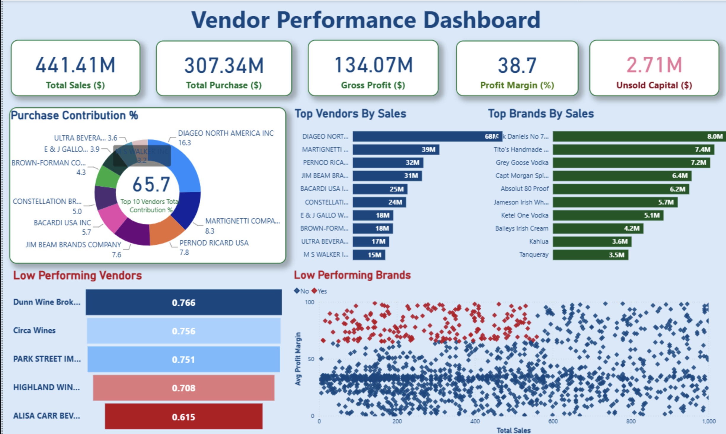
KPIs, purchase contribution by vendor, top vendors and brands by sales, low-turnover vendors and low-sales, high-margin brands.
Results / Key insights
These findings are descriptive. They come from the notebook analysis of the original data, which isn’t included in the repository.
- of purchase dollars from the top 10 vendors
- 65.69%
- estimated capital tied up in unsold inventory
- US$2.71M
- low-sales, high-margin vendor-brand rows
- 198
- The top 10 vendors account for 65.69% of purchase dollars, so purchasing is concentrated in a small group of suppliers.
- About US$2.71M is estimated to be tied up in unsold inventory (purchased minus sold units × purchase price). It’s an approximation: purchase and sales periods would need to be aligned to treat it as exact.
- 198 vendor-brand rows fall in the bottom 15% of sales and the top 15% of margin, the project’s thresholds for a closer look at pricing or promotion.
- Rows in the top sales quartile average a 31.18% margin (95% CI 30.74–31.61%) versus 41.57% (40.50–42.64%) in the bottom quartile. The difference is statistically significant, but it describes the two groups; it doesn’t explain why.
- Large orders show a lower average unit cost than small ones (US$10.78 vs US$39.07 per unit). This is an association that doesn’t control for product mix, not a measured saving.
Technology
- Python
- pandas
- SQLite
- SQL
- Jupyter
- Matplotlib
- Seaborn
- SciPy
- pytest
- Power BI
Limitations
- Without the raw data, the figures can’t be reproduced from the repository alone.
- Correlations, group comparisons and order-size patterns are descriptive and don’t establish causes.
- Unsold inventory is estimated from purchased minus sold quantities and assumes aligned periods.
- Margin groups are defined on vendor-brand rows by sales quartile, not on vendors as whole entities.
Source & implementation
Explore the repository.
Review the code and available project documentation on GitHub.